According to Cisco, mobile data traffic grew 81% in 2013.
It’s vital that your website is mobile friendly, not just for user experience but because Google have said that it ranks mobile optimised sites higher on mobile searches.
Google also “recommends that webmasters follow the industry best practice of using responsive web design, namely serving the same HTML for all devices.” This means not having a mobile specific site but having one website that changes in layout to suit the device that the user is using.
So what do you need to keep in mind when making your website responsive?
Here are my 10 top tips:
1 – Design the site for all screen sizes
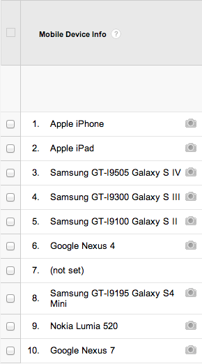
Don’t just concentrate on one phone and one tablet. There are a multitude of mobile devices available now, all with varying screen sizes. What looks good on a 3.5″ screen might not look so wonderful on a 5″ phablet and vice versa. Many developers recommend starting work on a mobile layout and then building out to larger screens, however take a look at your analytics and see where most of your traffic is coming from. In Google Analytics look under Audience > Mobile > Devices. If more users visit your site from a tablet rather than a mobile, there’s no need to ignore the data.
2 – Make it easy to read
It’s important to consider your site’s colour scheme and font to make sure it’s easy to read on a small screen. Single-column layouts tend to work best on a mobile because it’s simple to scroll and easy to scale and switch between portrait and landscape modes.
3 – Optimise for on the go browsing
Remember that most of the time, users on their smartphones will be out and about. They may well be short on time and be looking for something specific. Having a clear navigation that takes up less screen space is useful, as is highlighting important elements such as the enquiry form. Ensure that anything the user would need to click on a desktop is tappable. Using bigger buttons that can be tapped by thumbs is essential. Having to zoom in just to click a teeny tiny X in the corner of a pop up is very frustrating. Take a look at our mobile optimisation page.
4 – Always show all content
Just because someone’s on their mobile doesn’t mean they don’t want to be able to access the same information as desktop users. Try not to hide content from one device to another. Please do simplify the navigation and streamline the contact form but don’t deprive the user of content. There’s nothing more annoying that not being able to find what you’re looking for and then having to hunt for the link to visit the desktop version of the site.
5 – Think speed
Poor site speed will drastically affect your mobile bounce rate; 74% of mobile users will leave after 5 seconds waiting for a page to load. However pretty large images and multimedia content are, use them sparingly on the mobile version of your site because they can really slow a site down, particularly if the user is relying on a dodgy 3G connection.
6 Consider adaptive design
Adaptive design is where the decision on layout is made by the web server rather than client or browser. The server detects things like device and OS so it can send the correct version of the site. This is designed to be quicker for the user. There’s a handy article on adaptive design on the Econsultancy blog.
7 Consider interaction feedback
Many mobile browsers don’t have an obvious progress bar so it’s helpful to have interaction feedback to let the user know something is happening. An example of feedback is the link or button changing colour to let the user know they’ve tapped on it. You could also show a loading animation if something’s likely to take that little bit longer to load.
8 Have your content plan in place
Knowing what content, and how much, is going to go on each page will aid the design process. If the web designer creates a beautiful site with perfect symmetry this could all go wrong if you need to double the copy on the page. Creating a wireframe for your site with boxes representing your content will help you to know what and where to place content for different widths.
9 Test your site on multiple browsers and devices
The first step is to ensure the site works on the devices’ native browsers but then move on to test all browsers and different screen resolutions. This is another time that Google Analytics comes in handy as you can see which browsers are being used by your site visitors. This process is probably going to be lengthy but you want to ensure your site works for everybody.
10 Test it again!
Well I could hardly write a post about ten considerations with just nine, could I? Joking aside, test and test again is a good rule to live by if you want to ensure all users can view your site and access all the features.
Have you switched to a responsive site? How’s it working for you? Were there any stumbling blocks that you had to overcome? Leave us a comment.
References
//googlewebmastercentral.blogspot.co.uk/2013/06/changes-in-rankings-of-smartphone_11.html
//econsultancy.com/blog/64833-adaptive-web-design-pros-and-cons#i.1t2c0ryejfdryt
//moz.com/ugc/the-definitive-guide-to-googles-new-mobile-seo-rules